Uber is releasing an updated version of its app that aims to simplify and personalize the experience for customers.
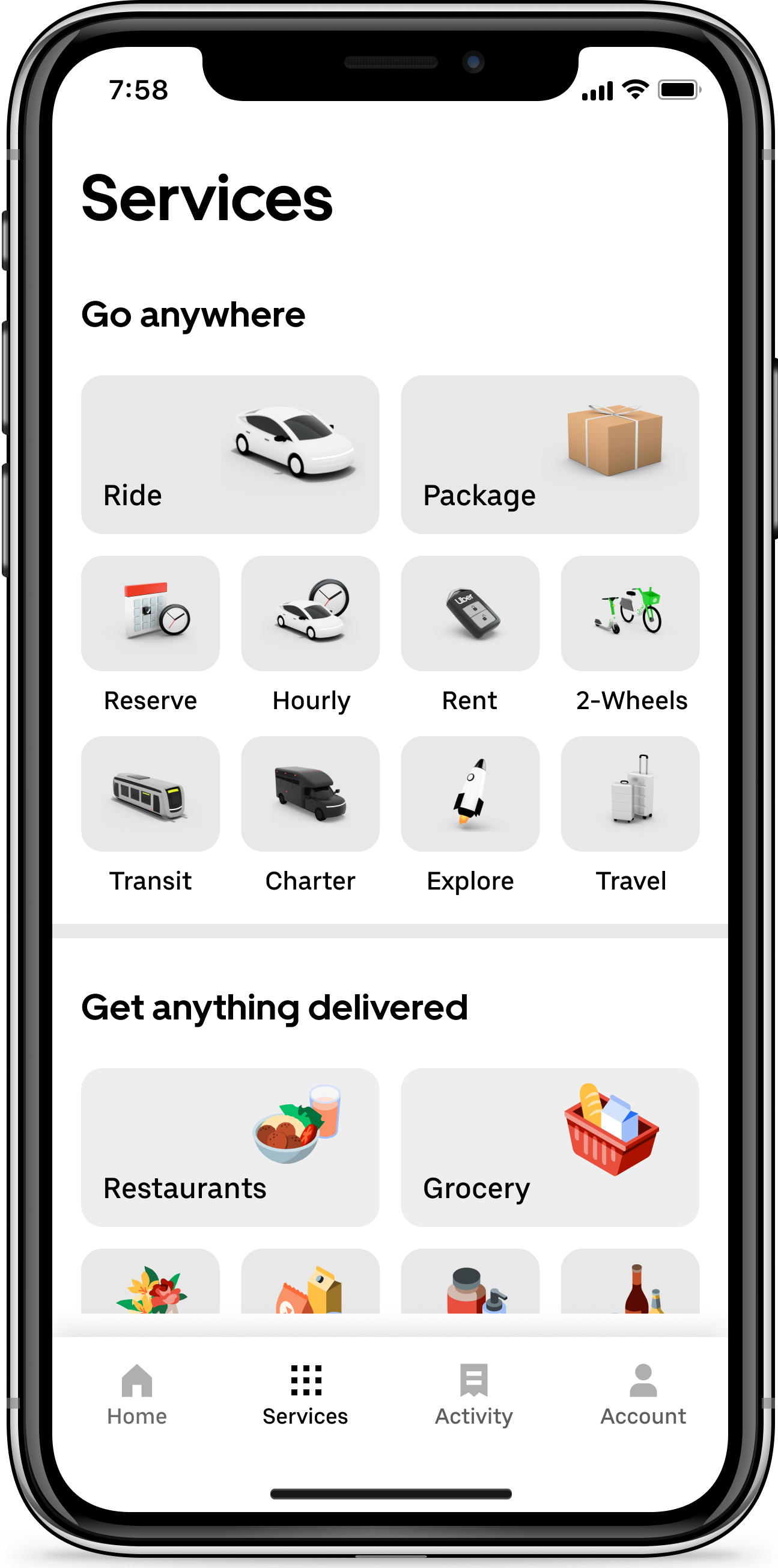
The new app has a more straightforward homescreen that removes the friction of a few extra taps when booking a ride or ordering a delivery. It also allows customers to more easily access saved locations, and some iPhone users can track a ride’s progress on their lock screen.
With the redesign, Uber wants to make the user experience so effortless and intuitive that more customers see Uber as the “one-stop-shop for going anywhere and getting anything,” according to Jen You, head of product for rides at Uber.
“The redesigned Uber app has increased awareness and consideration to a wider array of products, which has driven growth to several lines of business,” You told TechCrunch. “This redesign leans into our platform strategy by expanding the breadth and relevance of products that Uber customers can engage with every time they open the app, especially Uber One members who use more of our products more often and will now have easier access to all the offerings in their city.”
The release will go out Wednesday to “tens of millions” of customers in 1,200 cities around the world, according to Uber. Customers will need to make sure their devices and Uber app have been updated to see the new app.
A simpler homescreen

Image Credits: Uber
Many users have already had access to the new homescreen for weeks now (including myself and at least five other people I checked with in various cities). When the more widespread rollout happens today, users will be given the option to take a tour of the new homescreen once the app updates. The new homescreen includes carousels that prompt a user with “More ways to use Uber,” “Ways to plan with Uber” or “Ways to save with Uber” that provide options for services like adding a stop along a route, connecting with public transit, taking a Lime e-scooter or choosing a more comfortable ride.
A new “Services” tab at the bottom of the screen provides the user with all of the ride and delivery offerings available in that city, like e-scooters, dinner options, car rentals, package delivery and bus charter services. Also along the bottom of the screen is a new “Activity” tab that helps users keep track of past and upcoming rides and Eats orders.
Getting to know you better
When a customer taps “Where to?” on the new app, “Saved Places” will appear, as well as a suggestion of destinations and ride types based on a customer’s preferences, past trips and most likely destinations. The app will continue to learn about the customer so it can share more personalized recommendations in the future.
For example, if a user typically rides Uber Green, meaning with drivers who drive hybrid or electric vehicles, then that’ll be the first option they see when they open the app. This type of preference would also prompt the app to offer other zero-emission rides. Or if a user is likely to reserve rides in advance, the new Uber app will display other pre-planned options on the homescreen, the company said.
Updates to live tracking

Image Credits:
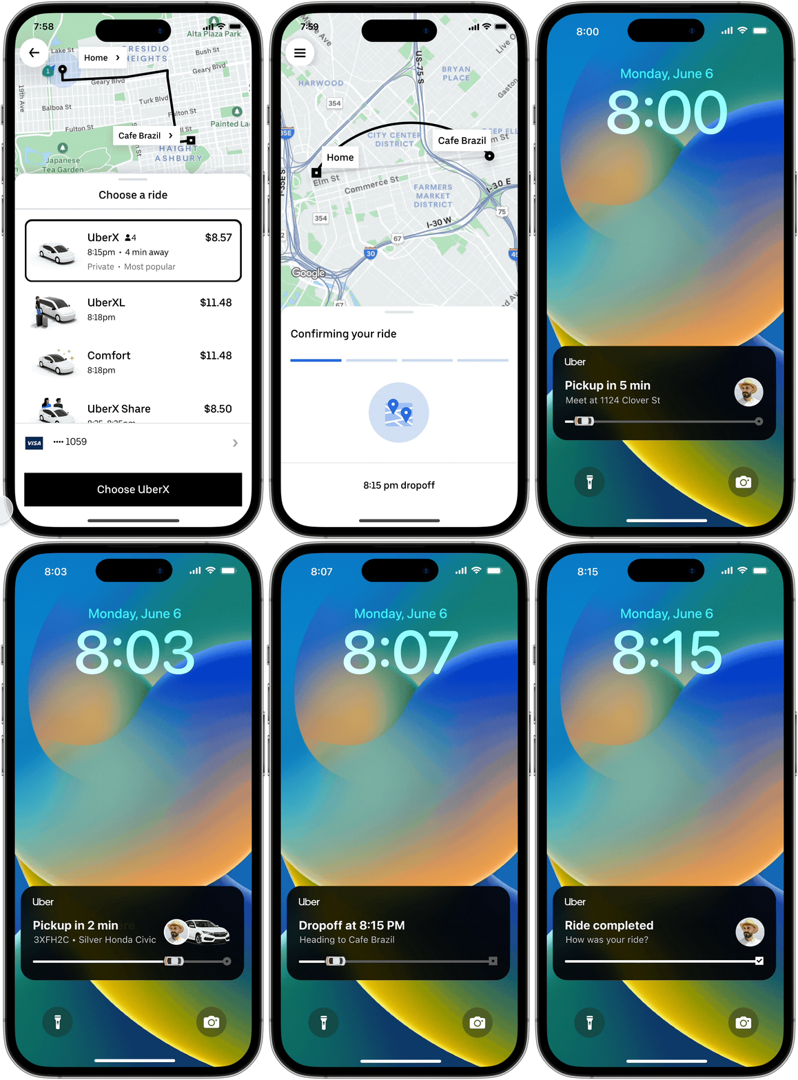
iPhone users running iOS 16 or later can track their rides all on the lock screen without having to open the Uber app via a “dynamic island,” which is basically a little bubble that displays content that’s running in the background. Today, users get notifications on their lock screen when a driver is on their way or close to pickup. The dynamic island will continuously run information like vehicle details — including driver photo, vehicle license plate, vehicle model and vehicle image — latest ETA information and trip status.
iPhone 14 Pro and Pro Max users will also be able to access the dynamic island, but only when the phone is unlocked. It’ll show up across the top of the phone’s screen and remains there even when a user is engaged with other apps.
Uber said live tracking and dynamic functionality will be available on the Uber Eats app in the coming months, and that the company plans to roll out a similar feature for Android customers in the coming weeks.
Uber redesigns app for simpler, more personalized experience by Rebecca Bellan originally published on TechCrunch
via Tech News Flow
No comments:
Post a Comment